Orchards
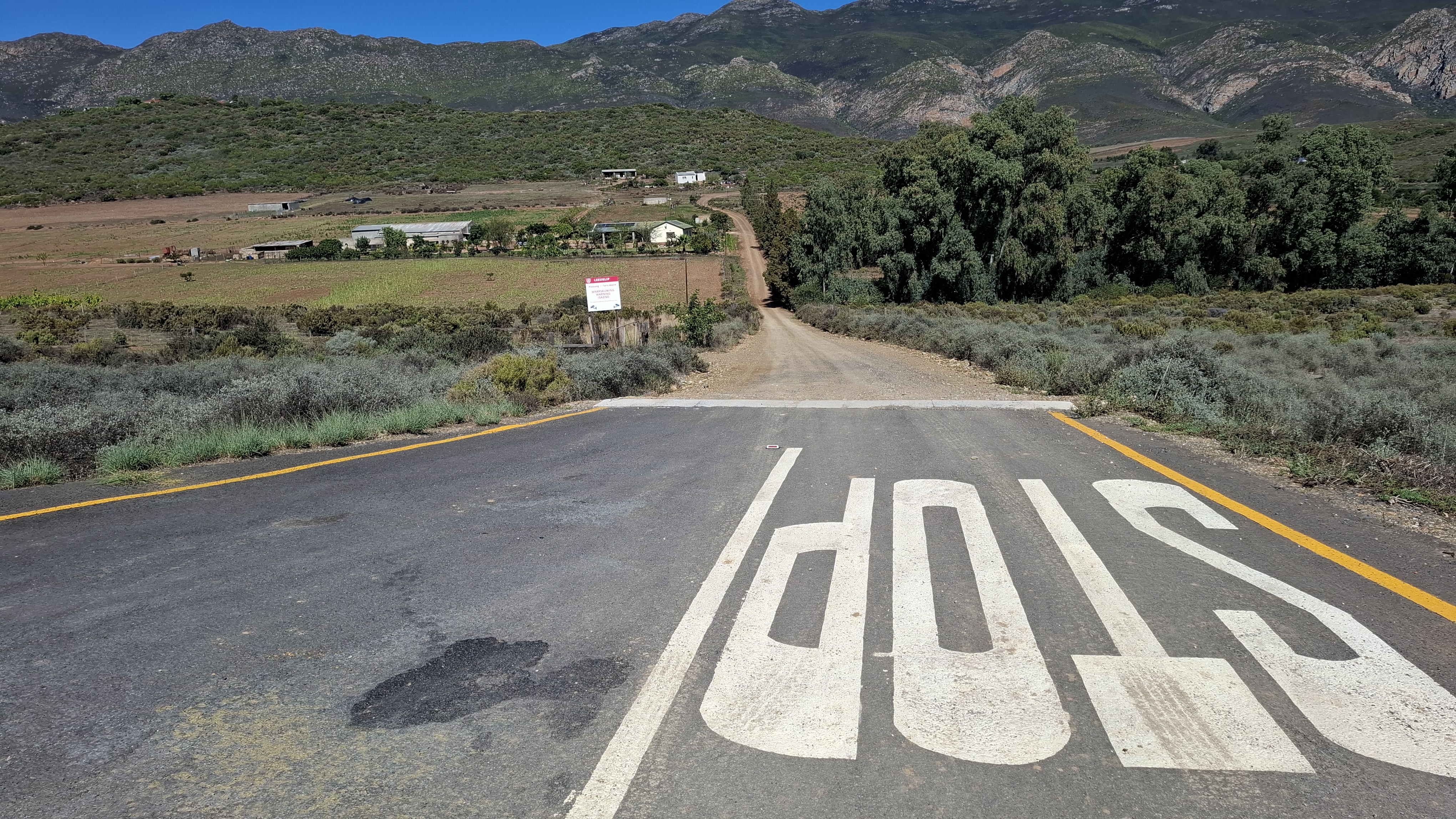
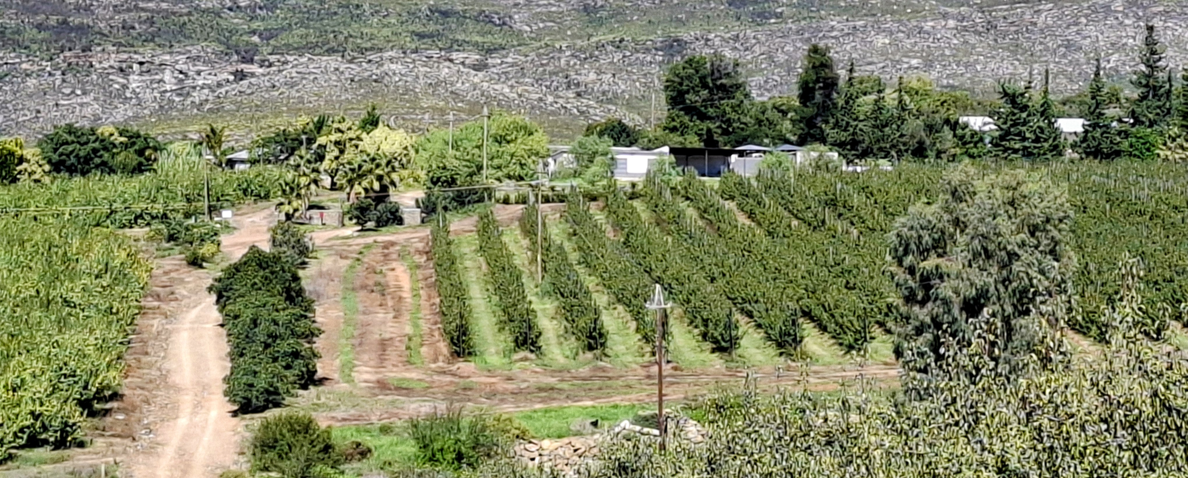
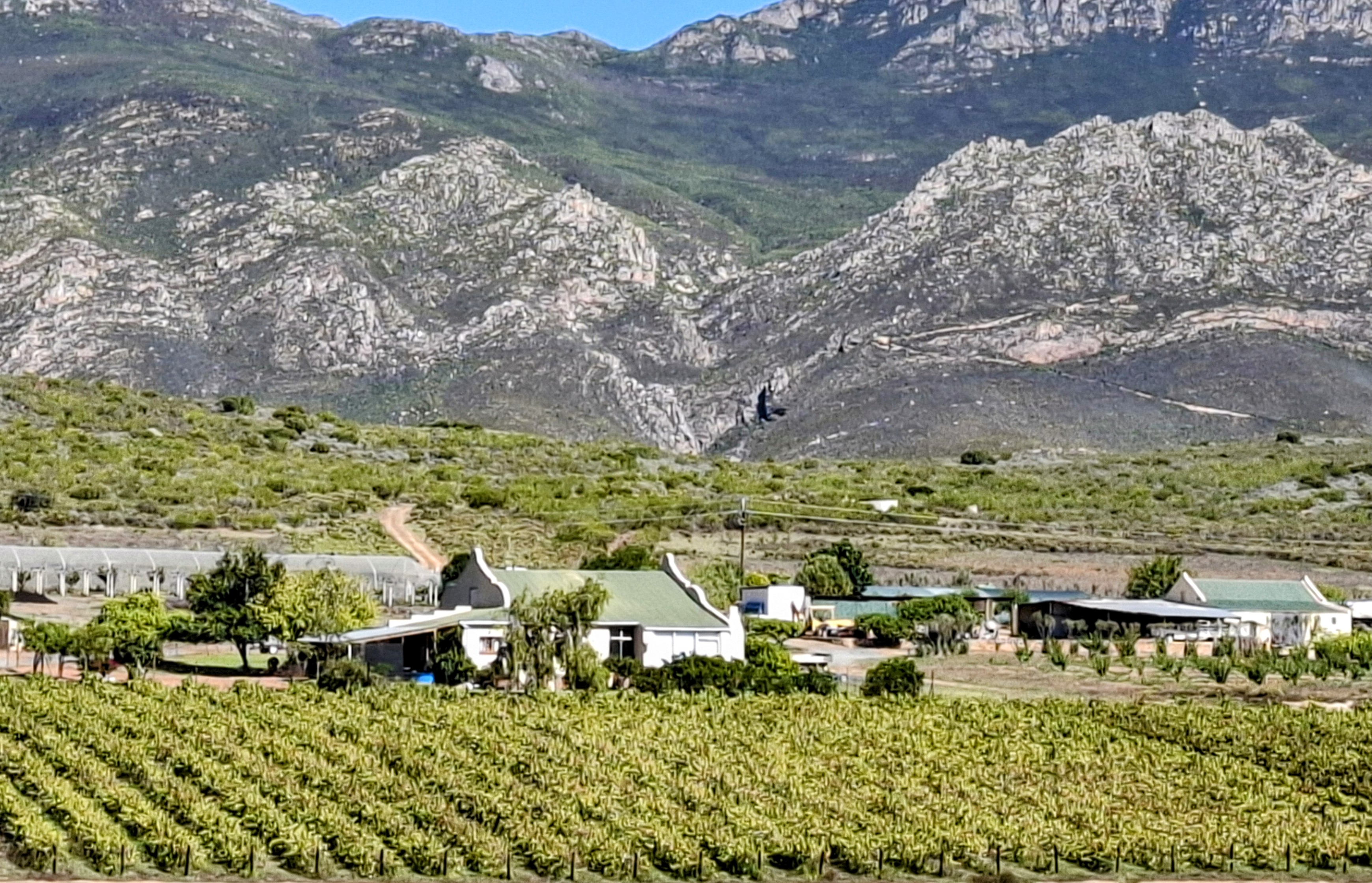
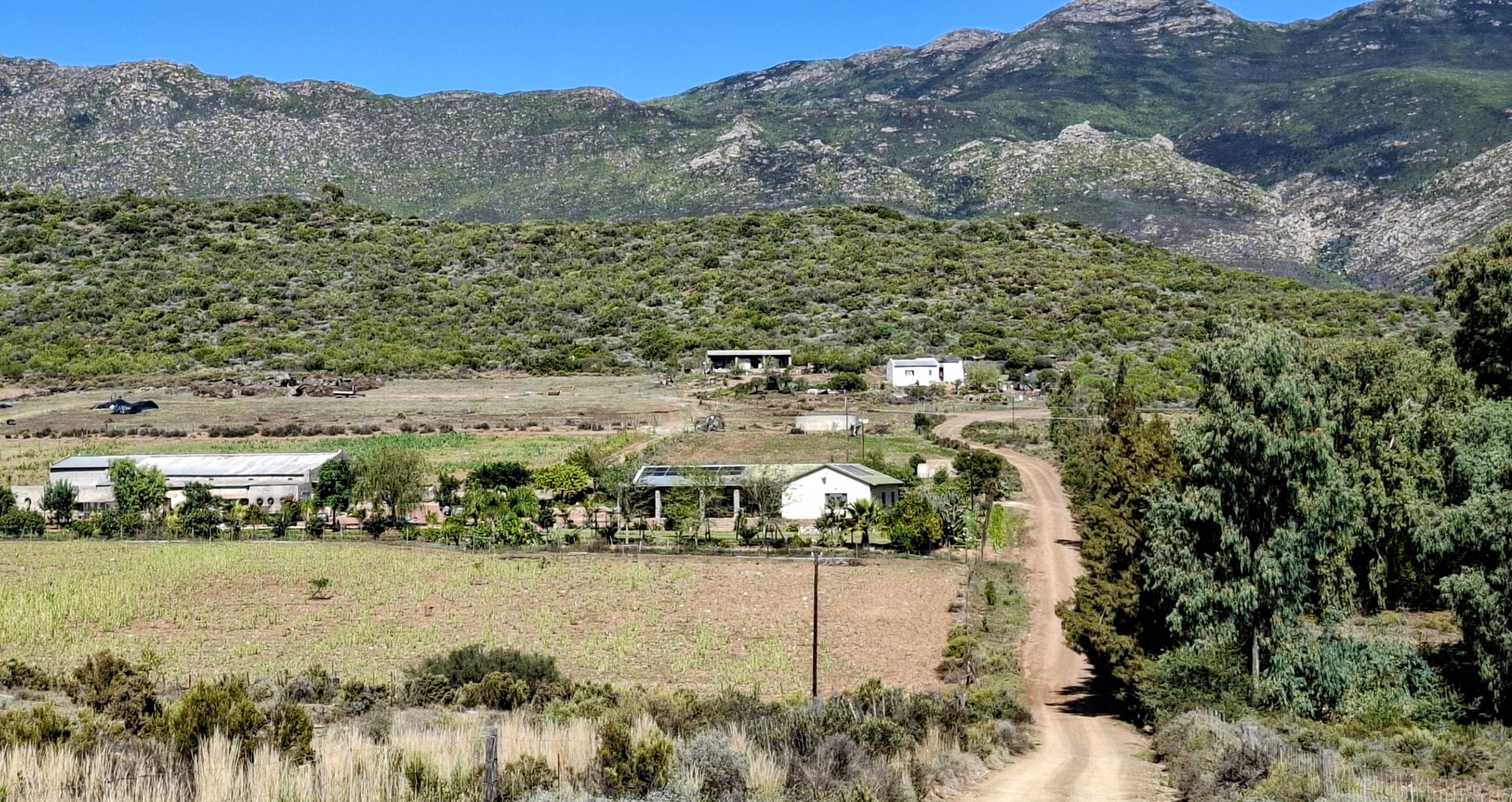
The photos tell you everything about why the colour works. The R62 is structurally rich but tonally restrained: dusty ochres, bleached scrub, grey-green fynbos, rock faces that absorb light rather than reflect it. The compositions were already there in the photographs. The converging dirt road, the ordered rows of orchards, the farmstead sitting against the mountain wall. I did not need to invent the geometry. What I did was refuse the palette.
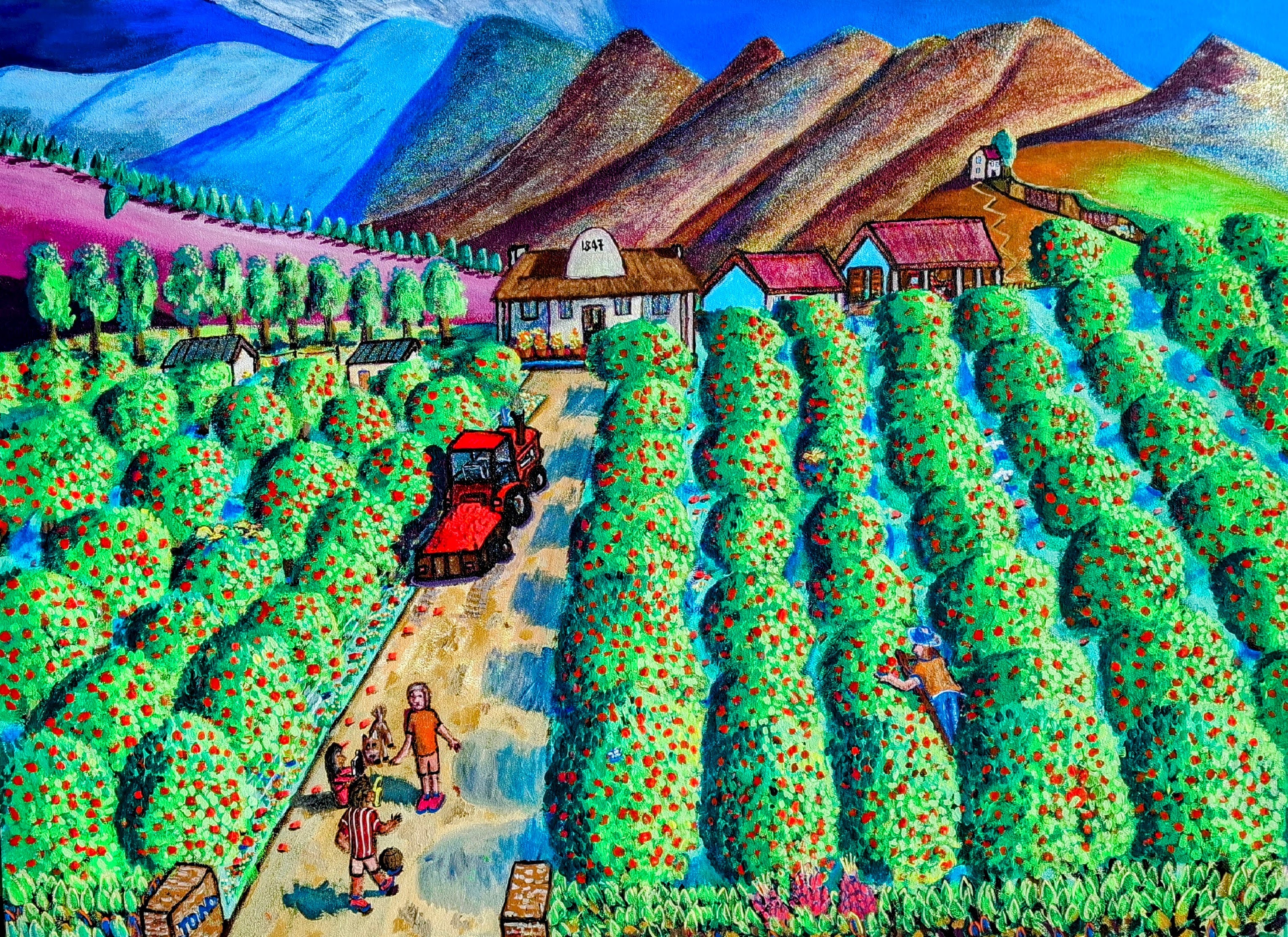
In the first painting, the mountains go from khaki-grey to layered blues, browns, and purples. The orchards, which in the photos read as a uniform grey-green mass, become saturated emerald rows studded with red fruit, almost decorative, like patterned fabric. The pink hillside on the left has no photographic basis at all. It is pure invention, and it works because it pushes the eye back toward the blue range. The "1847" on the Cape Dutch gable anchors it as a specific place, not a fantasy.
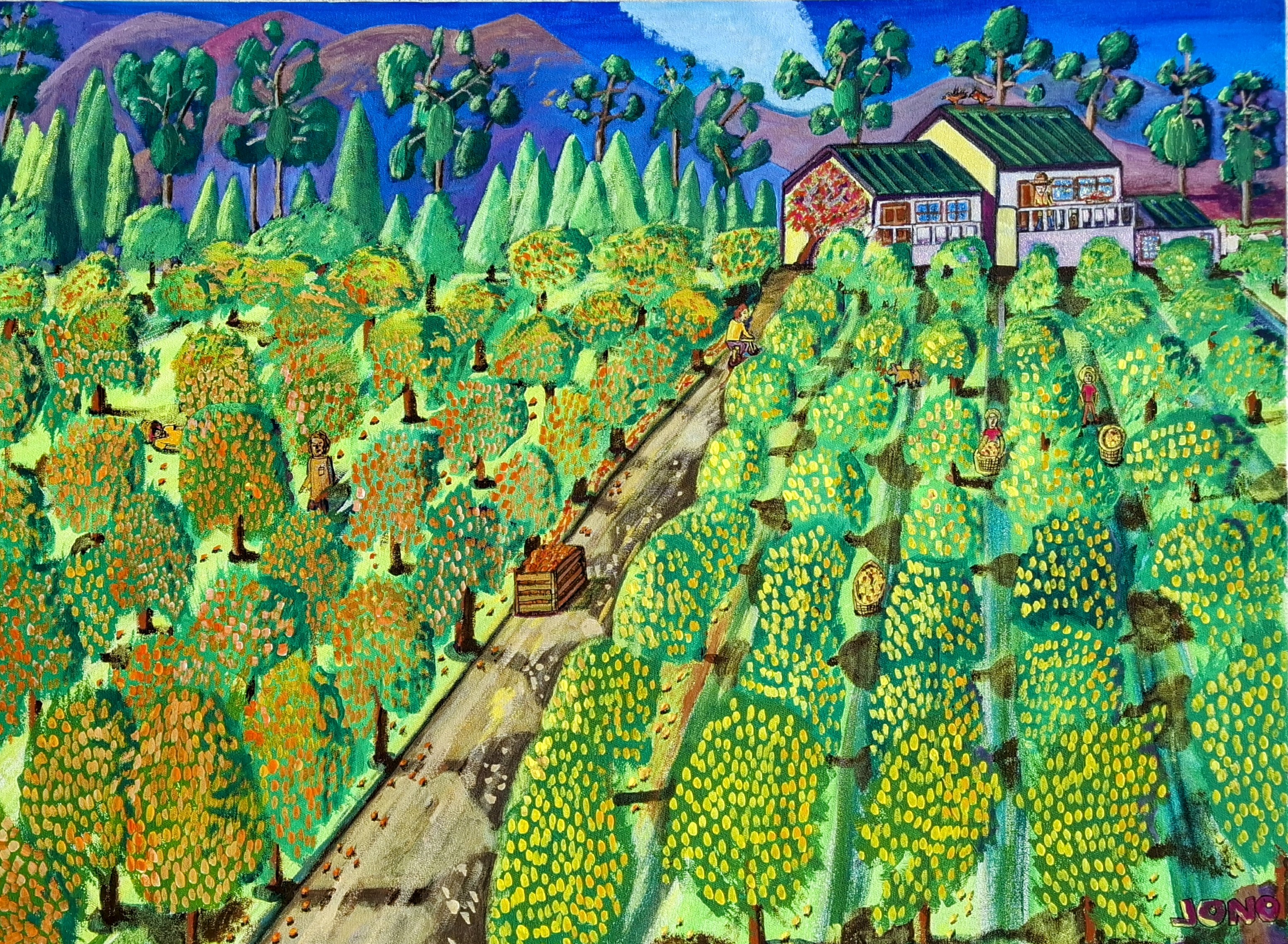
The second painting pushes further. I split the orchards into two distinct colour temperatures, warm orange-reds on the left, cool yellows on the right, which the photos do not support but which creates a natural division down the central path. The workers and crates give it a human scale that the photographs mostly lack.
The R62 gives you the bones: the row structure, the mountain backdrops, the Cape vernacular buildings. The colour is my editorial decision. I am painting the landscape as it feels in that heat and light, not as a camera records it. The naive style lets me get away with chromatic choices that would look absurd in a realist painting but feel right here, because the flattened perspective and simplified forms already tell the viewer this is an interpreted world.
The strongest move across both paintings is the mountains. In every photo they are the same grey-brown rock. In the paintings they become the most expressive element: blue, purple, layered. That inverts the hierarchy. In reality the orchards are the managed, human element and the mountains are indifferent geology. I have reversed that.